Intelygenz, a leading global AI and Software company catering to prominent B2B brands, approached us with a unique challenge. They recognised the need to gain traction in the US market and sought our help to clarify their brand for their target audience. Our goal was twofold: to establish Intelygenz as a standout player in the US market while ensuring global clarity, all while preserving the company's core values.
Rebranding an AI and Software development company for the global market.
Brand Identity | Brand Architecture | Motion | WebA Brand for everyone: Working for global corporations to recruiting passionate developers
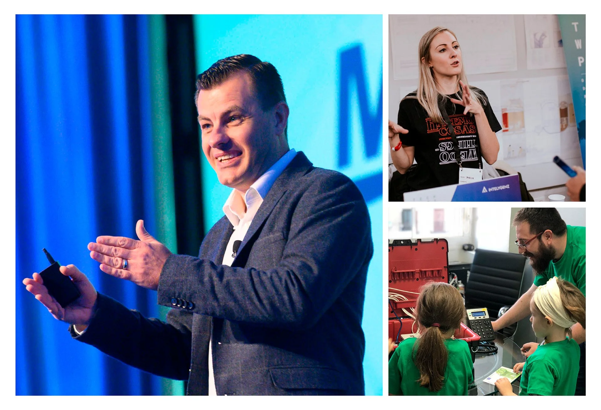
With the rebrand we aimed to strike the right balance between professionalism and approachability, appealing to a diverse range of businesses while also attracting industry leading developers and computer scientists. On the odd occasion the brand even needed to resonate with school children, as Intelygenz offer annual coding experience Kids Day event.
Simplifying the Structure: Endorsed/Sub-Brands
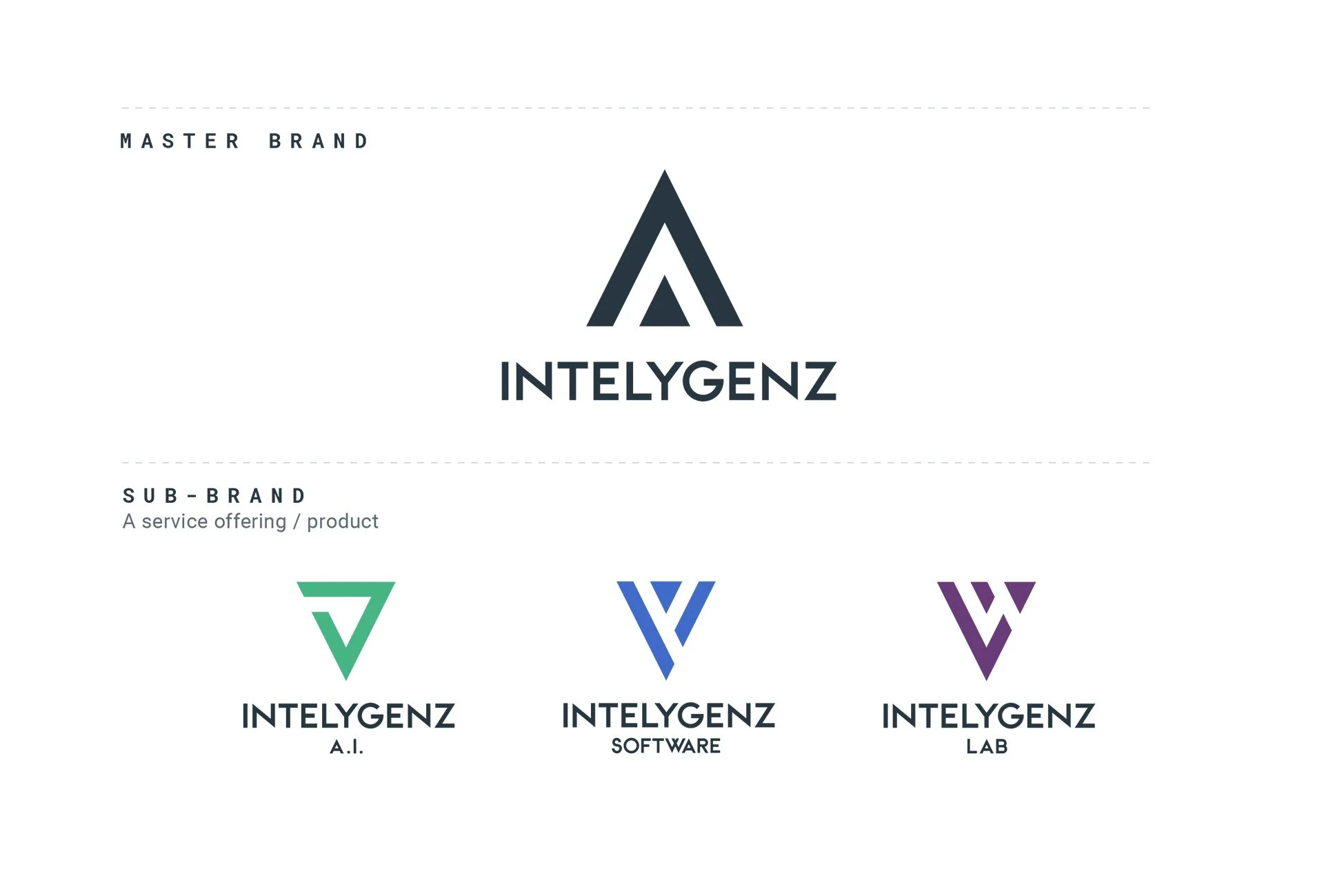
A key aspect of our strategy was creating a clear hierarchy and improved customer understanding. Intelygenz emerged as the primary brand, distinct from its associated products and services—represented by triangles pointing downward. Only Intelygenz stands apart, with a triangle pointing upward, symbolising its unique position as the master brand mark within the offering.
Crafting the Identity: The Brand Mark
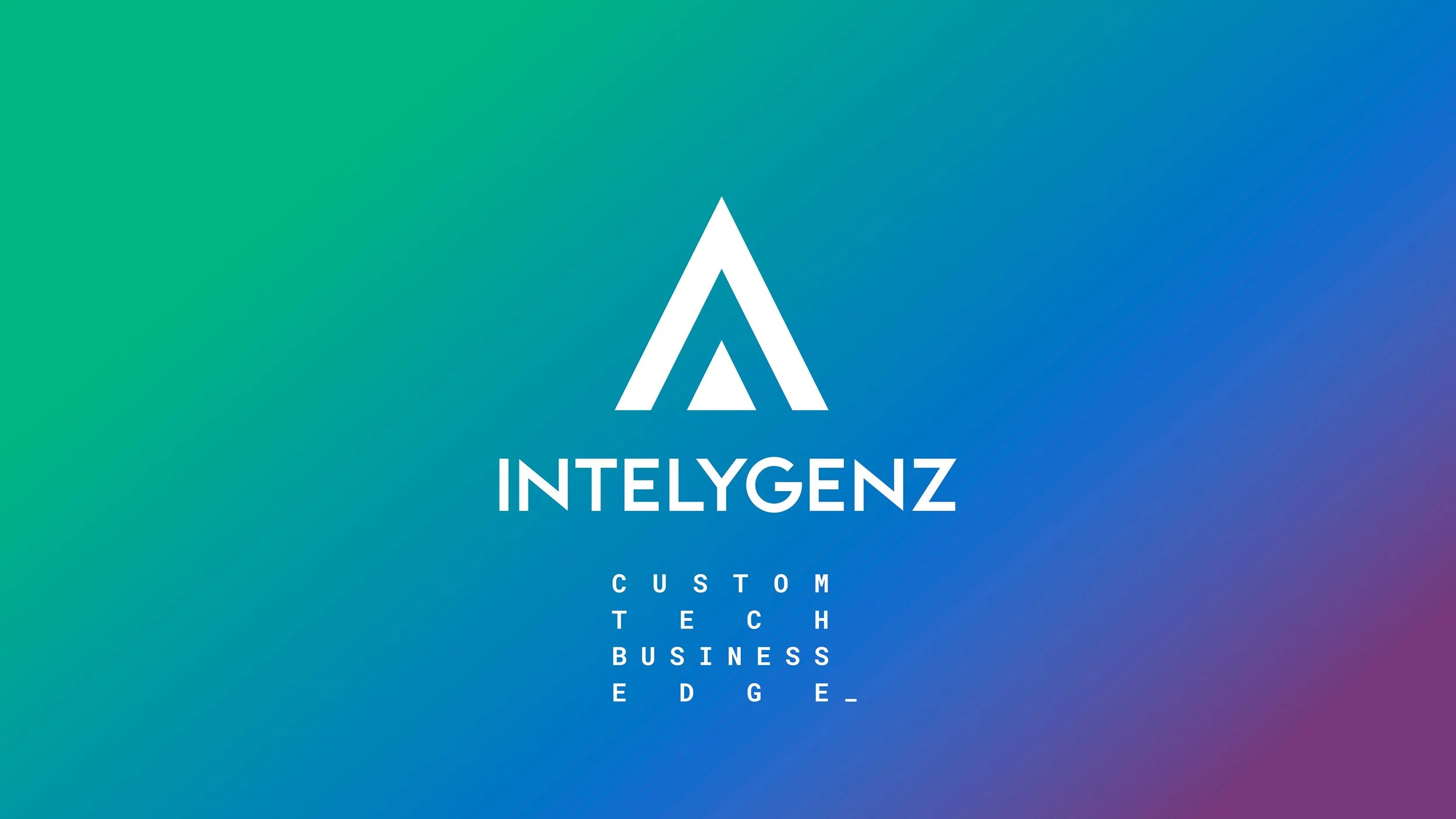
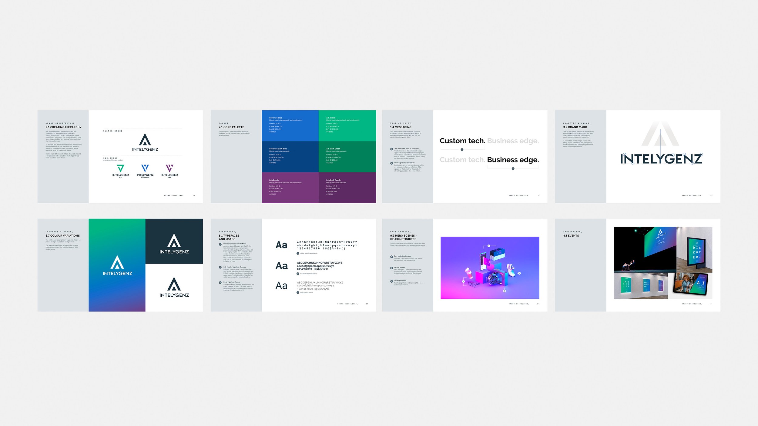
We took a meticulous approach to revamping the brand's visual identity. While retaining the three triangles, we reimagined the negative space to form one of the triangles within the new logo. To ensure legibility at smaller scales, we introduced custom typography with sharper angles, complementing the overall triangular theme. This design optimization is particularly valuable for digital applications with limited space.
Embracing Creativity: A Fusion of Photography, Animation, and Typography
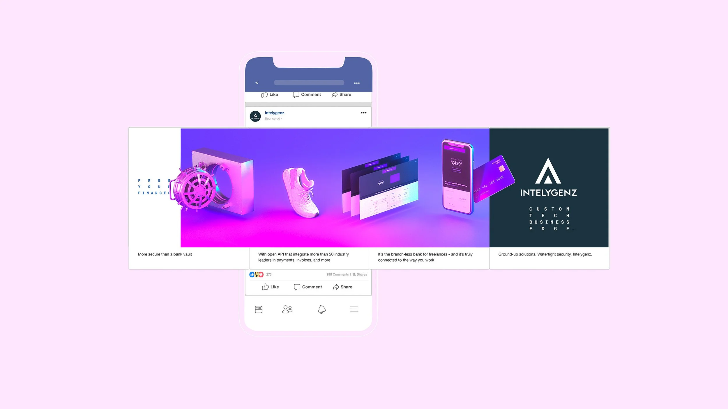
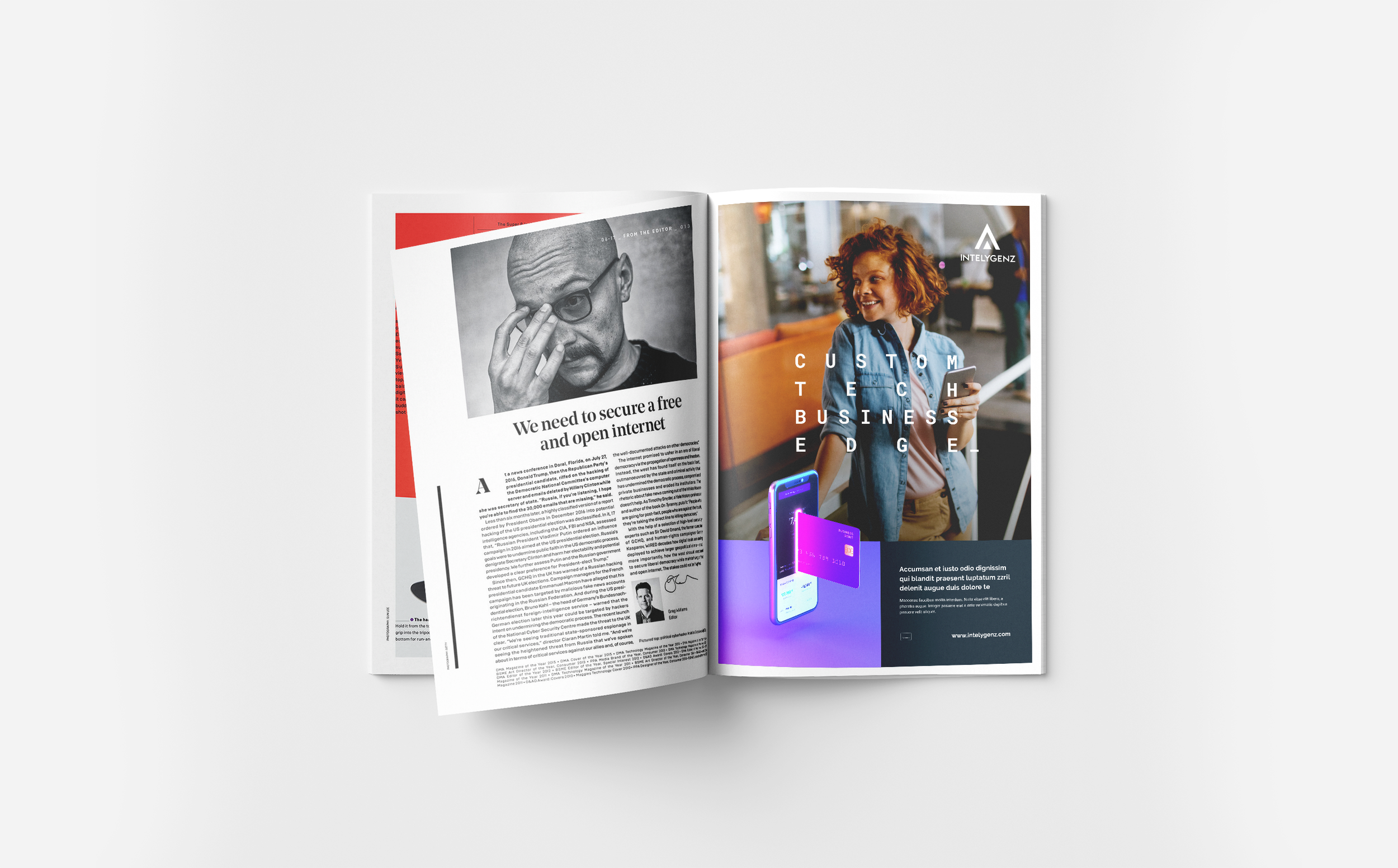
We harnessed the power of isometric illustration, photography, 3D animation, and carefully selected typography to breathe life into the brand. By incorporating these elements, we achieved an identity that resonates with audiences across various industries, capturing their imagination while showcasing technical expertise.
Bringing case studies to life: Conceptual colour gel 3D animations
One of the big challenges of this project was bringing the often complicated case studies to life, with clients that weren’t allowed to be named in most instances. To over come this I proposed a nod to the brand, selecting one colour to represent the client and one from Intelygenz to represent main service offering applied. Contextual 3D scenes were the built and animated to simplify down the complexity of the case studies, making it easier for non-technical people to understand.